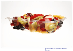
 Have you ever been browsing the aisles at the grocery store and decided on an item packaged in a clear container because you could see the food inside? Or maybe you chose one brand over another because the packaging design and colors caught your eye? Shoppers today are presented with an overwhelming amount of choices and brand owners often use packaging design to get their product to stand out over a competing product.
Several articles and studies have been released recently discussing the correlation between color, transparency and the consumer perceptions when it comes to food packaging. Continue reading to learn more about what these studies say regarding the link between consumer perceptions and packaging design.
While one of the most important elements of food packaging design is to keep the contents safe and fresh until it reaches the consumer, aesthetics are a close second. The actual design elements are important not just because it makes the product look cool, but because these aesthetic elements have actually been shown to have an effect on the consumer's psyche, influencing not only buying decisions but the actual perceived taste of the product.
An article published in Packaging Digest titled "The truth about how food packaging influences taste perception" discusses the indisputable link between perceptions of food and the way it is presented to consumers. The article cites an example from 2011, when Coca-Cola switched the can design from the traditional red design to a white design as part of a campaign to raise funds for endangered polar bears. Upon making the switch, Coca-Cola found that consumers were complaining that the company had changed the drink's formula, when all that had changed was the color of the can. The color 'red,' used in the traditional design, was found to be associated with sweetness, thus giving consumers the perception of drinking a sweeter drink when it was presented to them in a red can.
The article goes on to discuss how Charles Spence, a professor of experimental psychology at Oxford University has conducted numerous studies to further prove the correlation between design and consumer perceptions and buying decisions:
"Spence has proven time and time again that colors and the type of materials used in packaging can influence taste perception. He has found that a strawberry-flavored mousse tastes 10% sweeter when served from a white container rather than a black one; that coffee tastes nearly twice as intense but only two-thirds as sweet when it is drunk from a white mug rather than a clear glass one. He has also discovered that Colombian and British shoppers are twice as willing to choose a juice whose label features a concave, smile-like line rather than a convex, frown-like one." (Emily Phillips, Packaging Digest)
Findings of these studies is significant for brands because it clearly shows that packaging design heavily influences the consumer and presents another element to consider during the design phase.
Another article titled "In Food Packaging, Color Matters," discussed the results of a study titled "Light and Pale Colors in Food Packaging: When does this Packaging Cue Signal Superior Healthiness or Inferior Testiness?" Similarly, this study aimed to analyze how aesthetics of packaging influences the assumptions that consumers make about the product within. This study found that changing packaging colors manipulated the consumers perception of taste and healthiness stating, "healthiness evaluations were guided by package color even after the consumers had tried the product."
 But the color of packaging isn't the only influential factor - clarity and transparency has also been found to have an influence on the consumer. The study titled "Transparent Packaging & Consumer Purchase Decisions" conducted by the Association of Consumer Research, compiled results from a series of experiments that demonstrated that clear packaging "enhances perceptions of product trustworthiness and leads to higher purchase intention and increased product choice." (Association for Consumer Research)
The paper goes on to explain what led them to this conclusion, stating:
"We argue this is the case because (1) people associate the notion of "transparent" with honesty, openness, candidness and forthcoming behavior, (2) they often make inferences and judgment about products based on non-diagnostic packaging cues that are salient to purchase context (such as transparency) rather than diagnostic product information (such as ingredients)..." (Association for Consumer Research)
Additionally, a recent study conducted by C+R research on behalf of our UltraClear Polypropylene partners, Milliken & Co., called “The Voice of the Shopper” interviewed supermarket-goers regarding their preference when it comes to clarity in packaging. This study, among other research, has shown that consumers want convenience, reheatability and clarity, finding that:
- 38% of consumers said that they would choose one packaging over another if it allowed them to view the contents
- 8 out of 10 customers prefer clear, microwavable packaging over the alternative
- 70% of consumers said that they would pay $0.05 more for a clear microwavable package
Check out "The Voice of the Shopper" infographic to learn more about the findings of the study!
For more information on our products, check out our Materials section, or contact our team!


